Subtitle Style Guide: Rules Your Whole Team Can Follow
Subtitle Style Guide: Rules Your Whole Team Can Follow

A subtitle style guide is a short document that settles every recurring decision in your text track: capitalization, punctuation, line breaks, timing, speaker labels and sound cues. For US English work, the safest default is sentence case, two lines maximum, natural line breaks at phrase boundaries, and a reading speed near 160 to 180 words per minute. This article gives you those defaults with their sources, then shows how to turn them into a guide your editors, translators and reviewers actually follow.
TL;DR
- Write subtitles in sentence case. Keep all caps for acronyms, shouting or a defined speaker convention.
- Use two lines at most for landscape and square video, and break lines at natural grammatical points, not at a character count.
- Aim for about 160 to 180 words per minute, with roughly 0.3 seconds of display time per word as a floor.
- Subtitles carry dialogue. Captions for deaf and hard-of-hearing viewers also carry sounds, music and speaker identification.
- A guide only works if it has examples, one approver for exceptions, and a version everyone can find.
Table of Contents
- What a subtitle style guide should contain
- Subtitles and captions: what each one carries
- Capitalization rules for subtitles
- Punctuation in subtitles
- Line length, line count and line breaks
- Timing, reading speed and placement
- Perspective
- Keeping the guide alive across versions and reviewers
- Put the guide to work in Posthive
- FAQ
- Sources
What a subtitle style guide should contain
Most style guides fail because they are either a two-line note (“keep it short”) or a forty-page PDF nobody opens. The useful version sits between the two: short rules, each with an example, covering the decisions that keep coming up.
Start with the context that changes every other rule:
- Audience and purpose: translation subtitles for hearing viewers, or captions for d/Deaf and hard-of-hearing viewers.
- Language and spelling variant: for this market, American English. Pick one spelling convention and hold it for the whole production.
- Platform and format: streaming service, social video, broadcast, client review copy. Each has its own limits, and the file format you deliver matters too. If you are still choosing one, our comparison of SRT and VTT subtitle formats covers the practical differences.
Then record the decisions themselves. The table below is a starting template you can paste into your own document and fill in.
| Decision | What to record | Example entry |
|---|---|---|
| Capitalization | Case style, when all caps is allowed | Sentence case; all caps only for acronyms |
| Punctuation | Ellipses, dashes, exclamation marks, quotes | Exclamation marks for shouting or surprise only |
| Lines | Maximum lines, break rules | Two lines; break at punctuation |
| Timing | Reading speed, minimum duration, shot changes | 160 to 180 wpm; respect cuts where possible |
| Speakers | How to label, when | Label off-screen speakers when the source is unclear |
| Sounds | Which to describe, formatting | Lowercase in brackets, only if relevant to the story |
| Terminology | Names, brand terms, glossary location | Glossary v3, one owner |
| Exceptions | Who approves, where logged | Producer approves, logged in the review thread |
A terminology list and an exception log are what separate a living guide from a dead one. Industry guidance on building these documents recommends concise rules with examples for difficult decisions, a named approver for exceptions, and a log that records the cue or timestamp, the rule, the proposed treatment, the reason and who approved it. That is a small amount of overhead that prevents the same argument happening on every project.
Subtitles and captions: what each one carries
People use the two words loosely, and the difference matters for your guide. Translation subtitles mainly convey dialogue. Subtitles for d/Deaf and hard-of-hearing viewers, which US readers usually call captions, also need to describe relevant non-speech information: sound effects, music, tone of speech, unexpected pauses and inaudible dialogue. Ofcom’s access-service guidance draws exactly this line, and adds that speakers can be identified with colors, punctuation or positioning, and that off-screen speech should be labeled when its source is not obvious.
For US accessibility work, UC Berkeley’s guidance lists what captions must include: all spoken words, important non-dialogue sounds, correct spelling, punctuation and capitalization, speaker identification, and synchronization with the audio.

So your guide should state up front which track type it governs. If one project ships both, write two short sections instead of one muddled set of rules. Sound cues are the usual casualty here. Decide whether a cue is included only when it matters to the story, and say how it is formatted. The Described and Captioned Media Program suggests that when dialogue captions appear at the same time, essential sound-effect captions go at the top, and that thoughts or dreams can be shown in italics with an explanatory bracketed label.
Capitalization rules for subtitles
The default is simple: sentence case. Capitalize the first word of a sentence and proper nouns, and write everything else in lowercase. The BBC Subtitle Guidelines recommend sentence-style capitalization, and reserve all caps for acronyms, shouting or a clearly defined speaker-identification convention, not routine emphasis.
Two practical points belong in your guide:
- Sound descriptions are lowercase. Write [a door slams] or [soft piano music], not [DOOR SLAMS], unless the description contains a proper noun. The DCMP Captioning Key says the same for sound effects and onomatopoeia, and adds that proper nouns in speaker identification should be capitalized.
- Spelling stays consistent. The same source stresses that spelling must remain consistent throughout a production. That is a terminology list job: brand names, product names, place names and recurring technical terms all go in one glossary.
The question editors argue about most is emphasis. If a speaker stresses a word, resist capitals. Rewrite the line or let the performance carry it. If your team does want a convention for emphasis, such as italics, write it down with an example so the next editor does not invent a different one.
Punctuation in subtitles
For US English, follow standard American punctuation, then trim it for the screen. Netflix’s US English timed-text style guide advises avoiding complex punctuation such as colons and semicolons, double spaces and overused exclamation marks. Exclamation marks are for shouting or surprise, and ellipses are for pauses or trailing off.
The ellipsis is where most inconsistency creeps in. The DCMP Captioning Key recommends it for significant pauses but not merely to show that a sentence continues into the next caption. Editors often add trailing dots at the end of every split sentence; that habit clutters the screen and changes the meaning of the line. Your guide should say plainly: no ellipses for continuation.
A short punctuation block for your guide might read:
- One space after a period. No double spaces.
- Replace colons and semicolons with a full stop or a line break where the sense allows.
- Exclamation marks only for shouting or surprise.
- Ellipses only for real pauses or trailing speech.
- Quotation marks for on-screen text being read aloud; quotation marks plus italics for off-screen readings or voice-overs, as the DCMP Captioning Key recommends.
Add one before-and-after example for each rule. Examples settle disputes faster than wording does.
Line length, line count and line breaks
How many lines and where to break them is the part viewers feel most. The BBC recommends no more than two lines for landscape or square video, and three for vertical video. Netflix’s US English guide says the same for standard output: normally two lines at most, one line unless the character limit forces a second, and a bottom-heavy pyramid shape that avoids a one- or two-word top line.
The break itself matters more than the limit. The BBC prefers breaks at punctuation and says to avoid separating:
- an article from its noun,
- a preposition from the phrase that follows,
- a conjunction from its clause,
- a pronoun from its verb,
- parts of a complex verb.
In plain terms, split the thought where a reader would naturally pause. The BBC’s reasoning is that keeping grammatical and semantic units intact makes subtitles easier to process than breaking by character count alone. Berkeley’s accessibility team adds that two shorter lines read better than one very long line and advises against pushing the last word of a sentence onto the next caption.
Here is a worked example. A poor break:
She told the director that the final cut was ready for review
A better break:
She told the director that the final cut was ready for review
The second version keeps the clause together and makes the bottom line the longer one. Put a pair like this in your guide. Character limits per line depend on platform and language, so state the limit your delivery spec requires instead of borrowing one from a different platform.
Timing, reading speed and placement
Good timing is invisible. Viewers notice only when it is wrong. The BBC guidelines tell editors to time to speech onset and pace, and roughly to shot changes, with a recommended reading rate of 160 to 180 words per minute. As a minimum display-time estimate they suggest about 0.3 seconds per word, while stressing that editorial timing must also account for speech speed, text editing and shot synchronization.
Ofcom’s guidance for UK services adds three principles worth copying into any guide: subtitles should synchronize with the audio, stay on screen long enough to read, and avoid appearing before key information is spoken or lingering so long that they distract or needlessly overrun shot changes. For live work, Ofcom says providers should aim for a mean latency of no more than 4.5 seconds across live programming taken together, and acknowledges that accuracy and latency can pull against each other. Those are UK broadcast figures, so treat them as a reference point, not a US legal requirement.
For placement, the DCMP Captioning Tip Sheet says captions should be left-aligned, limited to two lines, placed within the safe zone, and positioned so they do not cover existing visuals or graphics. If your project has lower thirds or burned-in titles, your guide needs a rule for moving captions up and a rule for moving them back.

Styling choices such as font, size, color and background belong in the guide too, but legibility comes first. A caption that looks good and reads badly has failed. If your deliverable is a sidecar file, the viewer’s player may override your styling anyway, so note which settings you control and which you do not. Our own notes on subtitle styling guidelines for production teams go deeper on that side of the work.
Perspective
A style guide is only as good as the workflow around it. We see teams write a thoughtful guide, save it in a folder, and then watch three editors and two translators interpret it three different ways.
Our view is that the guide should live where the work happens. The rules, the glossary, the exception log and the approval all belong next to the video versions they apply to. When a client comments on cue 214, the reviewer should see which rule applies and which version of the file they are looking at.
That is why we built Posthive around versions, review and client ownership of deliverables in one workspace, with unlimited free seats on every plan so translators, reviewers and clients can all be in the room without a per-editor bill. A consistent subtitle track is mostly a coordination problem, and coordination is what a shared workspace is for.
Lorenz
Keeping the guide alive across versions and reviewers
The rules above only matter if the final file follows them. Three habits make that happen.
Name an owner and a version. One person maintains the guide and one person approves exceptions. When the guide changes mid-project, record what changed and which cues it affects. The same logic applies to your files: a subtitle track revised after client feedback is a new version, and losing track of which one was approved is a common and avoidable mistake. Our piece on avoiding lost video versions explains one way to keep that history clean.
Log the exceptions. Sometimes a rule has to bend: a fast exchange needs a higher reading speed, or a character name needs an unusual spelling. Record the timestamp, the rule, the treatment, the reason and the approver. That log answers the client’s question in six months and gives translators a precedent.
Review against the guide and the picture. A final pass should check the file against the guide and against the finished video, not just the script. Timing and line breaks only reveal themselves when you watch. For translated tracks, a structured second pass catches what the first misses; our two-pass subtitle translation QA and video translation workflow checklist show how production teams run it. Reviewer comments tied to timecode are far easier to act on, and turning timecoded video comments into NLE markers saves the retyping.
Finally, name the final deliverable files consistently and note where the approved version lives. When the project closes, archive the guide with it so the next season or the next language starts from the same rules. A three-copy archiving checklist covers that last step.
Put the guide to work in Posthive
If your team delivers subtitles, captions or translations for clients, Posthive gives you one workspace for the video versions, the timecoded feedback, the task and deadline tracking and the secure delivery. Every plan includes unlimited free seats, so reviewers and clients can join without extra cost per editor. The Pro plan is $49 per month and Enterprise is $99 per month; the details are on the pricing page.
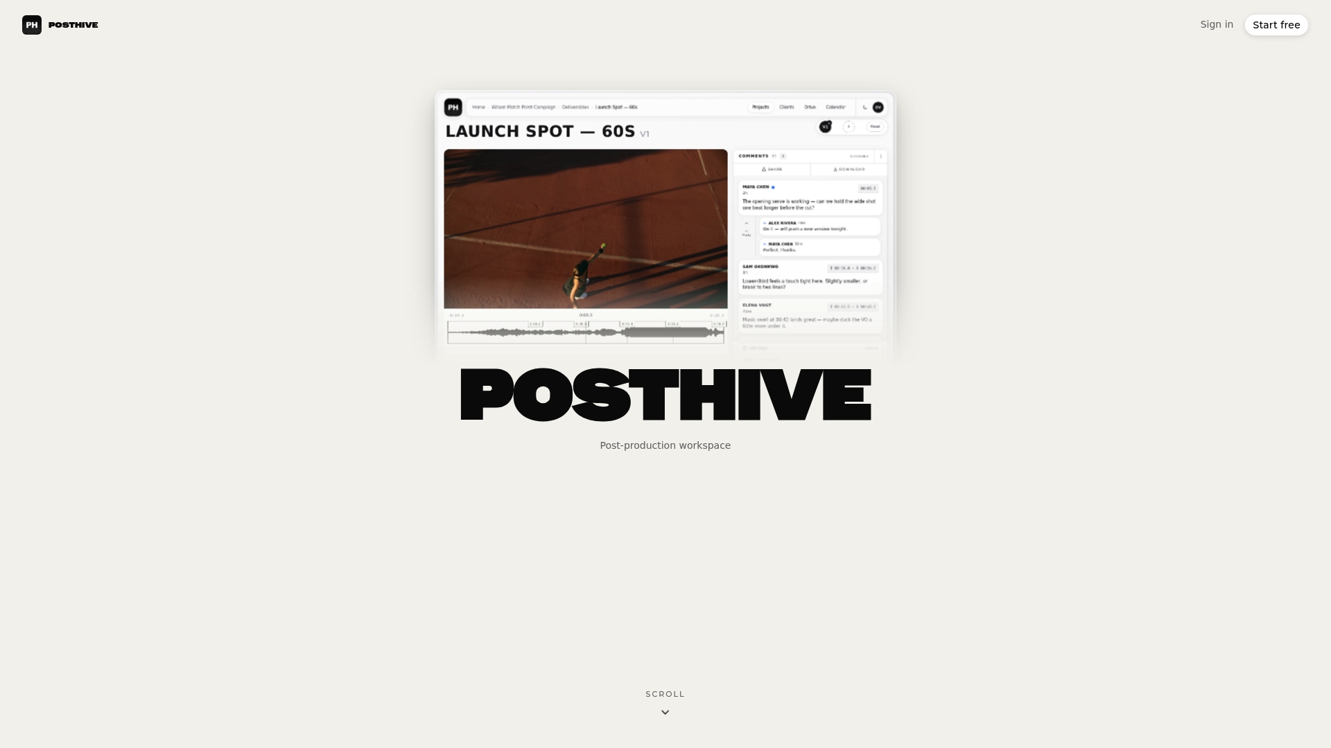
If you want to see how projects, versions and reviews fit together before choosing a plan, start with the Posthive workspace structure.
FAQ
What is the difference between a subtitle style guide and a caption style guide?
The structure is the same, but the content differs. A subtitle guide for translation focuses on dialogue, line breaks and reading speed. A caption guide for d/Deaf and hard-of-hearing viewers also covers sound effects, music, speaker identification and tone. If you deliver both, keep one shared guide with a clearly labeled section for each.
Should subtitles use sentence case or title case?
Use sentence case for ordinary dialogue: capitalize sentence starts and proper nouns. The BBC recommends this approach and reserves all caps for acronyms, shouting or a defined speaker convention. Title case on dialogue reads as a heading and slows viewers down.
Can I use ellipses, colons and exclamation marks in subtitles?
Yes, sparingly. Netflix’s US English guide advises avoiding colons and semicolons, using exclamation marks only for shouting or surprise, and using ellipses for real pauses or trailing speech. Do not use an ellipsis just to show a sentence continues in the next caption.
How many lines should a subtitle have?
Two lines is the standard maximum for landscape and square video, and the BBC allows three for vertical video. Prefer one line when it fits, and break at natural grammatical points so each line reads as a unit.
How fast should subtitles be?
The BBC recommends about 160 to 180 words per minute, with roughly 0.3 seconds per word as a minimum display estimate. Adjust for speech speed, text editing and shot changes. Check your platform’s delivery spec too, as limits vary.
Sources
- BBC Subtitle Guidelines
- Netflix US English Timed Text Style Guide
- DCMP Captioning Key: Language Mechanics
- DCMP Captioning Tip Sheet
- UC Berkeley Digital Accessibility: Captions and Videos
- Ofcom’s Guidelines on Providing TV and On-Demand Access Services
- How to Create a Subtitle Style Guide