
Rec. 709 vs P3: Which Color Space to Grade and Deliver In

Rec. 709 is the color space for standard dynamic range (SDR) television, web and social delivery. P3 is the wider space used for cinema and for most HDR mastering. The practical rule: grade and monitor in the space your audience will actually watch in, and keep every version labeled with the space it was made for. Most color problems on shared projects come from a mislabeled file, not from the standards themselves.
This guide is for editors, colorists, producers and freelancers who need to pick one and keep a team consistent. It covers what each standard defines, the P3 variants that cause confusion, when to use which, and how to stop a grade from drifting between versions.
TL;DR
- Rec. 709 is the HD television standard: D65 white, gamma 2.4, about 100 nits. Use it for TV, SDR streaming, web and social.
- P3 has the same blue primary but pushes red and green further out, so it holds more saturated color. Cinema P3 uses a different white point and gamma 2.6 at 48 nits.
- “P3” is a family: DCI-P3, P3-D65 and Display P3 share primaries but differ in white point and transfer curve. Never treat them as the same label.
- A P3 panel can show Rec. 709 content. The risk is viewing a Rec. 709 file on a wide-gamut display with the wrong settings, which looks oversaturated.
- Name every version by its color space and keep one approved version per deliverable.
Table of Contents
- What Rec. 709 and P3 are designed for
- The technical differences, side by side
- The P3 family: DCI-P3, P3-D65 and Display P3
- Is Rec. 709 the same as sRGB?
- When to use Rec. 709, and when to use P3
- Moving between spaces without wrecking the image
- What goes wrong on the wrong display
- Keeping color consistent across collaborators and versions
- Where Posthive fits
- Our perspective
- FAQ
- Sources
What Rec. 709 and P3 are designed for
Rec. 709 is an ITU-R specification released in 1990, with a gamut geared to define colors for the high-definition television market. It assumes a living room, not a theater. Art Adams notes that ITU 709 was designed for imperfect viewing conditions, such as bright rooms, while P3 assumes a dark, controlled space.
P3 was defined by the Digital Cinema Initiatives (DCI) group in 2010 and is the gamut most commonly used for digital movie projectors. SMPTE’s ST 2113 standard says P3 color spaces were developed around xenon lamps and micromirror devices in digital cinema projection and are used as working spaces in some production workflows.
The two have since overlapped. Apple’s documentation notes that current Mac, iPhone and iPad models support P3, which contains more colors than Rec. 709, with notable improvements in red and green. So a standard built for cinema screens now sits in many people’s pockets, which is exactly why the two get confused.

The technical differences, side by side
Three things define a color space for video work: the primaries (the corner colors of the gamut), the white point, and the transfer function (gamma). Comparing only the gamut misses two of the three.
| Rec. 709 | Cinema P3 (DCI-P3) | P3-D65 | |
|---|---|---|---|
| Red primary (x, y) | 0.640, 0.330 | 0.680, 0.320 | 0.680, 0.320 |
| Green primary (x, y) | 0.300, 0.600 | 0.265, 0.690 | 0.265, 0.690 |
| Blue primary (x, y) | 0.150, 0.060 | 0.150, 0.060 | 0.150, 0.060 |
| White point | D65 | DCI white (0.314, 0.351) | D65 (0.3127, 0.3290) |
| Display gamma | 2.4 (BT.1886) | 2.6 | Specified separately |
| Reference white luminance | 100 nits | 48 nits | Depends on the delivery |
The P3 primaries and the three white points come from SMPTE ST 2113. The Rec. 709 red primary, the gamma values and the luminance figures match Manco’s calibration guide, which also confirms the blue primary is identical in both standards. The Rec. 709 green primary of (0.300, 0.600) is the standard’s published value, which shares its primaries with sRGB.
How much wider is P3?
One widely cited comparison puts Rec. 709 at about 36% of the CIE 1931 color space and P3 at about 54%. Measured on the CIE 1976 u’v’ diagram, P3 is roughly a quarter wider. The extra room is mostly in saturated reds and greens: think a stage-light red or a neon green sign.

The Rec. 709 triangle sits entirely inside the P3 triangle. That means a P3 panel can reproduce every Rec. 709 color, but not the other way around. Colors outside Rec. 709 either clip or get compressed when you convert down.
White point and gamma are not details
Rec. 709 monitors are calibrated to D65 white. Cinema P3 uses a different white, derived from film projectors, so Art Adams points out that pure white in P3 looks greenish next to ITU 709. The gamma difference (2.4 against 2.6) and the luminance difference (100 nits against 48) change how shadows and midtones sit as well. A grade built on one set of numbers will not simply transfer to the other.
HSM University’s color course makes the broader point: two spaces can share primaries and still be different color spaces for practical purposes if the transfer function differs, and confusing them produces wrong images.
The P3 family: DCI-P3, P3-D65 and Display P3
This is where most forum threads on the topic go sideways. “P3” on its own tells you the primaries and nothing else. The Emby Learn comparison lays out the family:
- DCI-P3 (cinema): P3 primaries, cinema white point, 2.6 gamma. For theatrical mastering and DCP creation.
- P3-D65: P3 primaries with D65 white. Common as a grading and mastering space for HDR and for monitors that need a Rec. 709-style white.
- Display P3: P3 primaries, D65 white and the sRGB transfer curve. This is what Apple devices and much of the web use.
The ICC registry confirms the cinema entry: P3 primaries, 2.6 gamma, 48 cd/m², with white point chromaticities of either D65 or DCI. In other words, even the registry allows two whites under one name.
When a colorist says “P3” in a kickoff call, ask which one. If the answer is not written in the project notes, the next person to touch the file will guess.
Is Rec. 709 the same as sRGB?
Nearly, but not quite. sRGB shares Rec. 709’s primaries and white point, so the gamut is effectively identical. The real difference is the transfer curve: sRGB uses a piecewise curve that gives slightly more precision in the dark shadow region, while Rec. 709 is encoded differently and, as the same article notes, video streams carry primaries, transfer and matrix as metadata tags. This is why a Rec. 709 video viewed in a browser or image app can look a touch different in the shadows even when nothing is “wrong.”
For a team, the takeaway is small but useful: treat the two as the same gamut, and never assume they share a gamma.
When to use Rec. 709, and when to use P3
The cleanest rule comes from calibration practice: calibrate to the standard in which the finished work will be viewed.
| Deliverable | Grade and monitor in |
|---|---|
| Broadcast TV, SDR streaming, web, social | Rec. 709, D65 white, gamma 2.4, about 100 nits |
| Theatrical DCP | P3 at 48 nits, in a dark room |
| HDR streaming | P3 primaries inside a Rec. 2020 container |
HDR works this way because few displays can show the full Rec. 2020 gamut, so HDR is usually mastered within P3 and delivered in a Rec. 2020 container, using PQ or HLG transfer functions defined in ITU-R BT.2100.
Most client work is Rec. 709
If your deliverables are corporate video, commercials for web, social cuts, and broadcast SDR, Rec. 709 is your working space. Grading on a P3 display and delivering Rec. 709 is fine, as long as the display is set up to emulate Rec. 709 or you trim the result against a Rec. 709 view.
Mixed deliverables: widest in, then trim
When a project needs both an HDR or P3 master and an SDR version, Apple’s guidance is a good model. Begin work in the widest color space available and monitor in the widest space when grading. Then duplicate the project with the color space changed to Rec. 709 and do a trim pass to remove out-of-gamut colors, checking with video scopes or a Broadcast Safe effect for broadcast. Deliver in a codec that supports the color space of the project.
That duplicate is the key point for teams: you now have two legitimate versions of the same cut, each correct for its own destination. Our guide to ProRes versus H.264 for editors covers the codec side of that choice.
Don’t mix viewing environments
Adams argues P3 grading belongs in a theatrical environment because that is the only way to be sure the colorist sees what the audience will eventually see. A dim cinema-style room and a bright office with a laptop will never agree, whatever the file says. Match the room to the destination, or accept that client feedback from a laptop is feedback on a different image.
Moving between spaces without wrecking the image
The most common mistake is relabeling. HexCheck’s guide states that converting between Rec. 709 and Display P3 by relabeling is incorrect, because white point and transfer behavior must be transformed, not renamed. Tagging a Rec. 709 file as P3 does not widen anything. It just makes every color wrong in a predictable way, usually too saturated or too dull.
Use a managed pipeline
In an ACES-based workflow, camera-original and CG images are transformed to the common ACES2065-1 space, and Output Transforms written for each target display convert to Rec. 709 for HDTV, SMPTE ST 2084 for HDR screens and Rec. 2020 for UHDTV. Several renderings can run in one batch. A walk-through of the same idea in virtual production describes on-set monitors using output transforms to Rec. 709, P3 or Rec. 2020, grading in ACEScct, and delivery through output transforms to final formats.
You do not need ACES for every job. You do need the same principle: one working space, explicit conversions at each output, nothing relabeled by hand.
What goes wrong on the wrong display
The classic case is a Rec. 709 grade viewed on a wide-gamut laptop or iMac. Oliver Peters reports that in Premiere Pro, with display color management off, the image matches the Rec. 709 external monitor and the exported file but appears too saturated, especially reds. With it on, saturation matches the display but shadow detail is somewhat crushed. Neither setting is a bug. They are two different answers to the question of what the display should pretend to be.
The reverse also happens. A P3 grade played through a Rec. 709-only chain gets clipped or desaturated at the edges, and a P3-D65 master played where DCI white is assumed picks up a color cast.
A short checklist for the team:
- Write the working space, the output space, the white point and the gamma at the top of every project note.
- Make sure everyone who gives feedback knows what display they are viewing on and whether it is set to Rec. 709.
- Check exports against the original on a reference display before they go out.
- Rename any file whose color tags changed during export.
Keeping color consistent across collaborators and versions
Color science is only half of the problem on a real project. The other half is that a cut passes through an editor, a colorist, a producer, a client and a delivery step, and each of those people can open a different file on a different screen. The usual failure is not that someone chose the wrong standard. It is that three versions exist, nobody is sure which one is approved, and the client commented on a proxy.
A workable routine:
- One master per color space. A Rec. 709 SDR master, and if needed a P3 or HDR master, each named with its space.
- Review proxies match the master. If the review file is transcoded, make sure the transform is correct and the tags are right, so feedback applies to what you will deliver.
- Feedback tied to a version. A comment at 01:12:08 means nothing if it was left on version 3 and the colorist is now on version 5.
- Approval recorded. Know who approved which color pass and when.
We cover the review side in our dailies review workflow, and the checkpoints from ingest to archive in our post-production checklist. For solo editors, the freelance post-production workflow shows where color approval fits around picture lock.
Delivery formats multiply color decisions
Every extra deliverable is another color decision. A brand that wants a widescreen cut and a vertical social cut from one shoot is asking for two outputs from the same footage, and both will normally land in Rec. 709 for social platforms. Keep them as siblings of the same graded master rather than separate grades, so a correction made once reaches both.
Where Posthive fits
Posthive is a cloud post-production workspace that brings project management, version control, task and deadline tracking, collaborative review, client feedback and approval tracking, and secure media delivery into one place. For color work, that means the approved Rec. 709 master, the P3 or HDR master and the review versions can sit in one project, each version separate and each piece of client feedback attached to the version it was about.
Every plan includes unlimited free seats, so the colorist, the editor, the producer and the client can all be in the project without a per-seat bill. Pro is $49 per month and Enterprise is $99 per month. Posthive also offers plugins for NLEs and Google Calendar integration, so grading sessions and deadlines live next to the files.
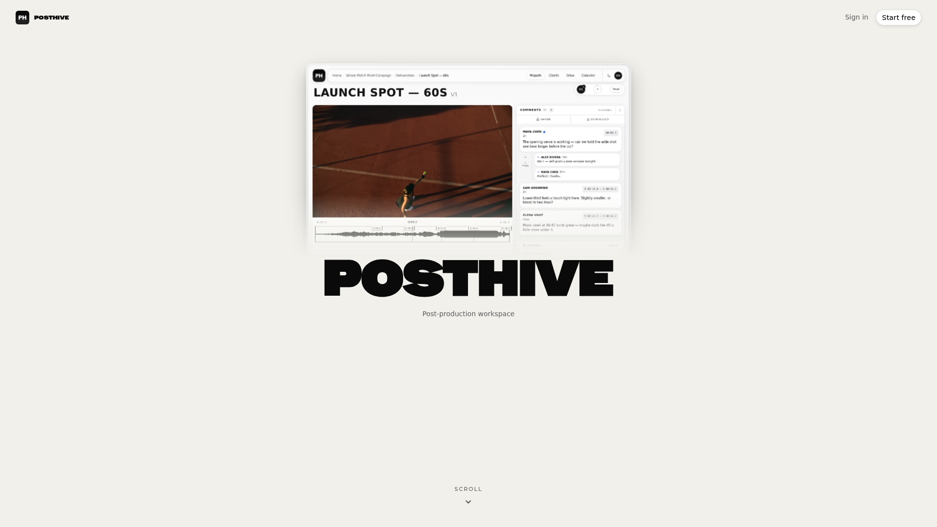
If your team is juggling several color-managed versions of a cut, see Posthive’s plans. When the master is ready, our guide to a preview to master delivery workflow shows how to hand it over securely.
Our perspective
Color standards are well documented. What is poorly documented is which file the team agreed on.
When we think about Rec. 709 and P3, we start from the people, not the primaries. A colorist can calibrate a monitor perfectly and still lose a week because a client signed off on a different export than the one that ships. The standard did its job; the workflow failed.
That is why we built Posthive around versions and ownership. Deliverables and versions belong to the client and the team in one workspace, review and approval happen on the version in question, and everyone who needs access gets it, because seats are unlimited and free on every plan. Color decisions are most reliable when everyone looks at the same file and knows what it was made for.
Our advice: pick the space by the destination, write it down, and make that note travel with the file.
Lorenz
FAQ
Is Rec. 709 better than P3?
Neither is better in general: they are built for different destinations. Rec. 709 is the right target for TV, SDR streaming, web and social. P3 is the right target for cinema projection and as the mastering gamut for HDR, where its wider reds and greens are used.
What is the difference between DCI-P3 and Display P3?
They share the same primaries. DCI-P3 uses a cinema white point and gamma 2.6, while Display P3 uses D65 white and the sRGB transfer curve, as Emby Learn’s comparison lays out. Display P3 is what Apple devices use.
Can I grade in P3 and deliver in Rec. 709?
Yes, and it is a common approach. Work in the widest space available, then make a duplicate version in Rec. 709 and trim out-of-gamut colors, checking on scopes. A P3 display can reproduce all of Rec. 709, so the check is about the conversion, not the monitor.
Why does my Rec. 709 video look too saturated on my Mac?
A P3 display shows Rec. 709 colors more vividly unless the app is told to manage color for it. In Premiere Pro, the display color management setting changes this: with it off, the viewer matches the exported file but looks more saturated, per Oliver Peters’ explanation. Judge the grade on a calibrated Rec. 709 view.
Sources
- Color Gamut: Understanding Rec.709, DCI-P3, and Rec.2020
- SMPTE ST 2113 (2018)
- HDR and Wide Color Gamut in Final Cut Pro
- Working with Wide Color Gamut in Final Cut Pro X
- Rec.709 or DCI-P3? Calibrating Your Video Monitor
- What is DCI-P3? | What Hi-Fi?
- Is P3 the New 4K?
- Color spaces, transfer functions and color management
- P3 Color Gamuts | Emby Learn
- DCI P3 | Three Component Color Encoding Registry
- sRGB vs REC709: An introduction and FFmpeg implementations
- Rec. 709, DCI-P3, Display P3, and ACES | HexCheck
- A Guide to ACES
- Colour Management in Virtual Production: A Practical ACES Workflow Guide
- Understanding Premiere Pro’s Color Management
- Vertical vs. Horizontal Video: Get Both From One Shoot